How responsive web design works
A practical explanation of responsive design, mobile layout, SEO benefits, and the key elements of strong user experience.
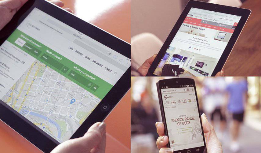
How responsive web design improves mobile experience, SEO, and conversions
What is responsive web design?
Responsive web design allows the same website to display correctly on phones, tablets, laptops, and desktop screens. Content adapts to screen width, images keep their proportions, and navigation remains easy to use.
This matters because many users first open a website on a mobile phone. If the copy is hard to read, buttons are too small, or images are distorted, the visitor will leave quickly.
How responsive design affects SEO
Google evaluates pages through the mobile experience, so responsive layout is part of a solid technical SEO foundation. A website that loads quickly, reads clearly, and avoids layout shifts has a better chance to keep users and convert them.
Key traits of a strong responsive website
- readable copy without zooming,
- clear navigation and large enough buttons,
- images that do not distort,
- fast loading on mobile networks,
- forms that are easy to complete on a phone,
- stable layout without unexpected shifts.
One website, same content, better UX
Responsive web design is not a separate mobile version. It is one website that adapts intelligently to the device. This makes content easier to maintain, protects SEO structure, and reduces technical errors.
Web Design Serbia studio builds responsive websites with clear structure, optimized images, and CMS administration so visitors on every device can understand the offer and send an inquiry quickly.
If you want the website to be clear on phone, tablet, and desktop, view responsive web design and the Business website package.
Planning a similar project?
If you want to apply this advice to your business website, review the related services or send a short inquiry so we can estimate the scope.