Is Your Website Not Mobile-Friendly? How It Affects Google Search
Mobile-friendly and responsive design are standards for modern websites because they affect readability, speed, SEO foundations, and inquiries.

Why mobile experience affects SEO and conversions
Why is a mobile-friendly website now the standard?
Users increasingly open websites on mobile phones. If the text is hard to read, buttons are too small, images distort, or the page loads slowly, visitors leave quickly and choose another result.
Google treats mobile experience as an important part of website quality. Responsive design, loading speed, stable layout, and clear navigation all affect user experience and the SEO foundation.
What makes a strong mobile layout?
- copy is readable without zooming,
- menus and buttons are easy to use,
- images keep their proportions,
- contact forms work smoothly on phones,
- pages load quickly without unexpected layout shifts.
Mobile-friendly design also helps conversions
A strong mobile layout is not only for SEO. It helps visitors find the service, view references, read the key information, and send an inquiry without friction.
Web Design Serbia studio builds responsive websites with clear structure, optimized images, simple navigation, and technical setup that supports stable Google visibility.
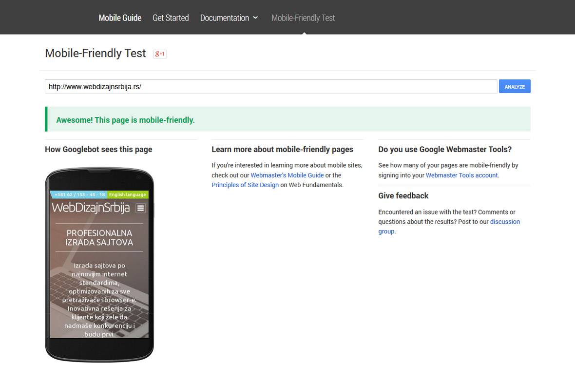
For a better mobile layout, view responsive web design and packages that include mobile-friendly website development.
Planning a similar project?
If you want to apply this advice to your business website, review the related services or send a short inquiry so we can estimate the scope.